Results for the WAVE Accessibility checker:
What did you find when you ran the WAVE accessibility report on your blog post(s)? What did you expect and what was surprising? Is there anything you will do differently going forward?
When running the WAVE accessibility report, I didn’t find anything too surprising. It mentioned a part of my blog that had little contrast between the background of the slide and the words. This is a good point to keep in mind and it is often something I forget when creating slides or a post. Making sure there is high contrast will ensure that the words are clear and easy to read.
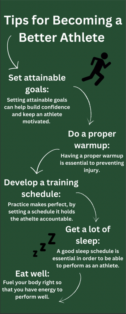
Infographic on Tips for Becoming a Better Athlete:
For this module, I decided to make an infographic on “tips for becoming a better athlete” because sports are a big part of my life and a passion of mine.

Design principles that I had in mind while creating the infographic:
- Alignment
- Balance
- Negative space
Which design principles did you use to create your infographic in Canva?
When creating my infographic in Canva, I had the design principles above in mind. I made sure that the smaller words were aligned with the titles, and I also made sure that there was balance on the infographic by creating a “zig zag” with my information. Originally I had all of my info stacked in order, by zig zagging my information, I was able to create a bit more negative space to make it look less busy.
Which elements of a ‘good infographic’ were you able to incorporate?
When making the infographic, I tried to limit the colour palette and keep imagery simple. I also made sure to not use more than one font to keep it simple.
What does the template make easier and what does it make harder when creating your infographic?
I didn’t use a template because I have used them in the past but I actually find it easier to make it from scratch because that way I can put things exactly where I want them. Other times it is helpful to use a template when I don’t have any format ideas in my mind already.
What do you think the presentations in The World’s Worst Powerpoint Presentations have in common?
All of the presentations were very difficult to follow as they had a lot of words and in some cases, more than one font. The colouring on the slides also made it hard for the slide to get its point across. The imagery wasn’t simple which was also a distraction. Lastly, there was little to no “white space” making it super busy.
Great infographic! I really like how simplistic you kept everything; it makes it much easier to follow the content present in the infographic, and the few images that are included help to make it a bit more “fun” to read through. I fully agree that sometimes using a template can make creating things much harder than if you just created it from scratch.