Author: charliemccullough (Page 2 of 2)

Module 4- Principles of Learning Design and Active Learning

Interactive Video using H5P:

https://charlieswordpressblog.opened.ca/wp-admin/admin.php?page=h5p&task=show&id=1

Reflection:

What was your experience of trying out H5P? Which of the activities do you think you would make most use of in your teaching context and what would you use them to do? Which ones do you think require the most resources to create?

I found H5P quick and efficient to use! I love how many tools you have access to as a teacher using this site. Some tools that I believe I would frequently use would be interactive videos, arithmetic quizzes, and some other fun game-like types of content. I would use these to engage my class in whatever subject we are indulging in by posting them on a site like moodle. Interactive videos could take multiple resources if you are not using a video that already exists on the internet and instead choose to film one yourself.

How have you found the balance of passive and active learning in this course for your learning? How does it compare to your experience in other courses?

I believe that this class has a good balance of active and passive learning. I have noticed active learning through group meetings and passive learning through readings and videos. The only thing that I would say most of my other courses have compared to this course are more active discussions and group projects. I personally find it quite challenging to complete group discussions and projects online and instead I like the idea of interacting with classmates by responding to posts.

Lesson Plan:

For this lesson plan, I chose to do a lesson on healthy eating habits. I think this is a super important topic for people of every age to learn about. At the end of the lesson, I created a learning activity for creating a simple meal plan. This is an important life skill to be able to plan and execute a healthy meal.
Assignment 2- Video for a Learning Purpose

Video Link:

Reflection on Video making process:

What is the learning purpose of your video?:

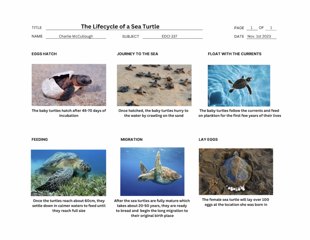
The purpose of this video is to briefly educate primary elementary students (kindergarten to grade 3) on the lifecycle of a sea turtle. I talked through the six steps of the sea turtle lifecycle. By breaking it into small, simple steps, it helps the younger students be able to retain this information.

Which of the principles we’ve covered this term (e.g., Mayer/Universal Design for Learning/Cognitive Load Theory) did you incorporate into your design and why?

A principle that I had in mind for this specific demographic of learners was the cognitive load theory. Because my target audience ranged from kindergarten to grade 3 I kept in mind the fact that this age’s attention span is quite short. To make sure I wasn’t overloading these young students with information, I kept each step brief and the drawing simple. One of Mayers Principles that I had in mind to reduce extraneous processing is the Redundancy Principle by including graphics and narration instead of on-screen text. I also used the voice principle by using a human voice to narrate the entire video. Probably the biggest principle that I followed was the Embodiment Principle by drawing graphics as I explain, rather than explaining an already drawn graphic.

What was challenging about capturing your own video?

The challenge of capturing my own video was getting the right angles for my drawings with the camera that I was using. I used a simple iPhone camera as it was the only equipment I had access to. I was worried about the quality of the video but it ended up being decent quality. I was also lucky enough to have a friend who was willing to film for me but I won’t always have someone with me to be able to capture me teaching.

What did you find easiest?

What I found easiest about making this video was the editing as I did it on iMovie. I was able to speed up the footage, add music and voiceovers, and cut footage quite easily to make the video smoother.

How would you approach capturing video differently next time?

As a future elementary teacher, I believe that I will be making many videos like this in the future. Next time, I would consider using a small microphone to capture audio a little bit better. I would also consider using a different video editing software other than iMovie because iMovie feels like more of a beginner editing platform.

Storyboard:

Script:

Module 3- Storytelling and Creating Video

Simple Branched Story:

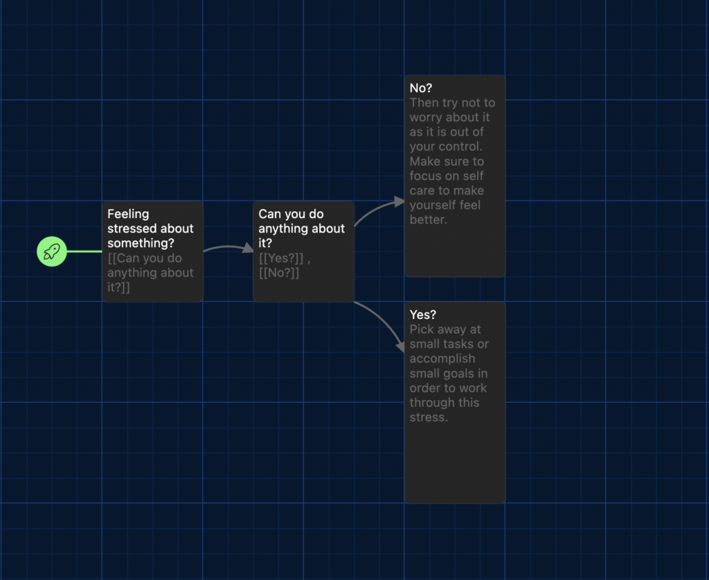
For my branched story, I kept it fairly simple as I was focusing on learning the new software rather than the story itself. I chose to make branches about how to deal with stress. I feel like this is relevant at the moment as this midterm season has been stressful for many students including myself. I am still not super comfortable using this software, it was a little confusing but it was a fun process.

Describe a meaningful learning experience that started with a story that you heard. What made it impactful for you? What senses did it appeal to? Did you recognize any of the storytelling techniques reviewed this week?

I remember in the 9th grade when my class was learning about how rubber acts as an insulator and therefore doesn’t allow electricity to pass through an object. My 9th grade science teacher told our class a story about how she and her dad were at a farm while it was pouring rain and they were holding onto an electrical fence. The only reason why they didn’t feel a shock is because they were standing on the ground wearing rubber gum boots and therefore the current could not pass through them and complete the circuit.

For some reason to this day, I remember this story super clearly. My teacher telling a personal story that happened in her life made me able to retain this information by thinking about this story. I believe this story has also touched on the Sensory and Motor Cortex by explaining the exact positioning and weather which helps the listener imagine the feeling of holding onto a metal fence while standing in the rain.

In the reading this week, 7 Storytelling Techniques Used by the Most Inspiring TED Presenters, which of the presenters did you find most compelling? What technique(s) did you recognize in their talk?

The three techniques that stood out to me the most were immersing your audience in a story, telling a personal story, and using the element of suspense. My personal favourite that I find very captivating is the element of suspense because I find it really grabs my attention and makes me listen intently until the end of the story.

When Richard Turere told his story about growing up in his homelands in Kenya, I felt transported as a listener into a different world. This story captivated my attention because it was fascinating to listen to someone who grew up in a completely different lifestyle than mine.

Module 2- Design Principles for Effective and Accessible Multimedia

Results for the WAVE Accessibility checker:

What did you find when you ran the WAVE accessibility report on your blog post(s)? What did you expect and what was surprising? Is there anything you will do differently going forward? 

When running the WAVE accessibility report, I didn’t find anything too surprising. It mentioned a part of my blog that had little contrast between the background of the slide and the words. This is a good point to keep in mind and it is often something I forget when creating slides or a post. Making sure there is high contrast will ensure that the words are clear and easy to read.

Infographic on Tips for Becoming a Better Athlete:

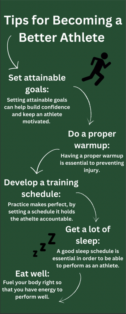
For this module, I decided to make an infographic on “tips for becoming a better athlete” because sports are a big part of my life and a passion of mine.

Design principles that I had in mind while creating the infographic:

  1. Alignment
  2. Balance
  3. Negative space

Which design principles did you use to create your infographic in Canva?

When creating my infographic in Canva, I had the design principles above in mind. I made sure that the smaller words were aligned with the titles, and I also made sure that there was balance on the infographic by creating a “zig zag” with my information. Originally I had all of my info stacked in order, by zig zagging my information, I was able to create a bit more negative space to make it look less busy.

Which elements of a ‘good infographic’ were you able to incorporate?

When making the infographic, I tried to limit the colour palette and keep imagery simple. I also made sure to not use more than one font to keep it simple.

What does the template make easier and what does it make harder when creating your infographic?

I didn’t use a template because I have used them in the past but I actually find it easier to make it from scratch because that way I can put things exactly where I want them. Other times it is helpful to use a template when I don’t have any format ideas in my mind already.

What do you think the presentations in The World’s Worst Powerpoint Presentations have in common?

All of the presentations were very difficult to follow as they had a lot of words and in some cases, more than one font. The colouring on the slides also made it hard for the slide to get its point across. The imagery wasn’t simple which was also a distraction. Lastly, there was little to no “white space” making it super busy.

My Comments on Others Blogs

My comment on Chris’ Blog:

My comment on Nat’s Blog:

My comment on Chris’ 2nd Blog:

My Comment on Alys’ Blog:

My comment on Addi’s Blog:

My comment on Justin’s Blog:

Module 1- Screencasting and the Theories of Multimedia Learning

Screencasting of “How to do long division”

Process:

First I started by finding a platform that I could use to write the equations. I thought about a whiteboard because it is fun and an easy way to explain a process step by step. I used Lucidspark which is a white board website. I then downloaded Screenpal to record my screen and audio while I was presenting. One thing that would make this process easier that I could try in the future it getting a writing pad that connects to my laptop. That way instead of using my mouse, I could write on the writing pad for smoother writing.

Reflection:

  1. The audience that I had in mind for my screencasting presentation was grades 5-7 (or the age that one would learn long division). This is one of the reasons why I chose a whiteboard because it models step by step how to do it, as though I am with the student writing it in front of them.
  2. One principle that I had in mind was the Redundancy principle. I made sure to not incorporate too many images or too much text as it can distract the student from the whole point of the lesson. I was also aware of the Cognitive Load Theory, making sure to stick with a very basic tutorial for long division even though there are other ways to teach long division. By doing multiple examples and using the same process every time, it teaches the basics of solving these equations.
  3. The Redundancy principle is one that I haven’t necessarily followed in the past. I used to make all of my PowerPoint with many images and colours, which seems nice but is actually a distraction from the whole point of the presentation. Especially considering that my audience in this case is young children, things like images and colour can easily distract this age group.

Newer posts »